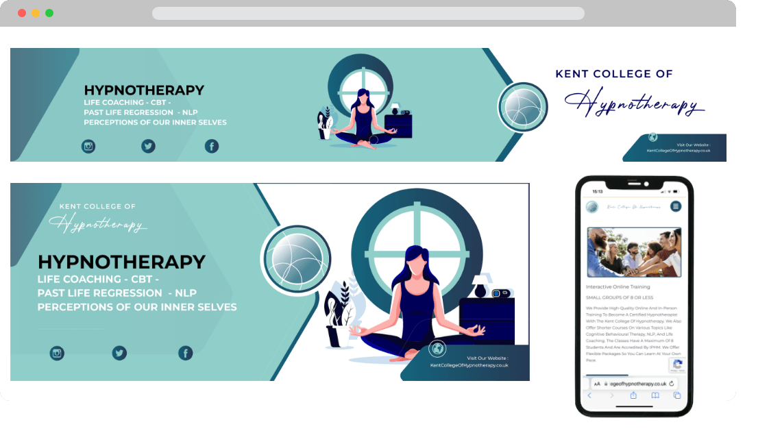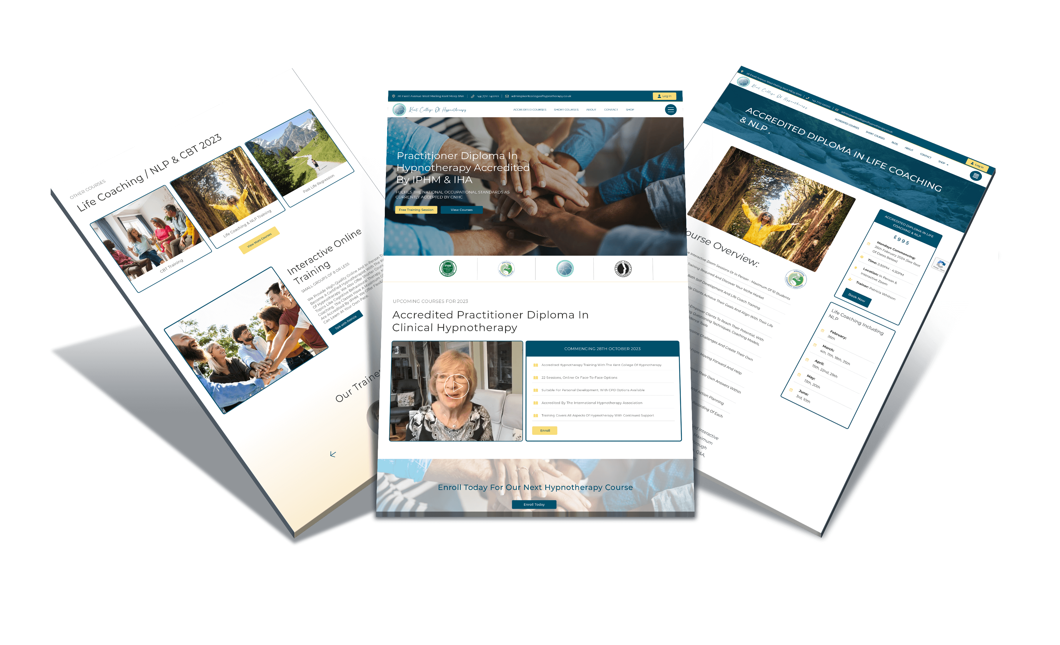
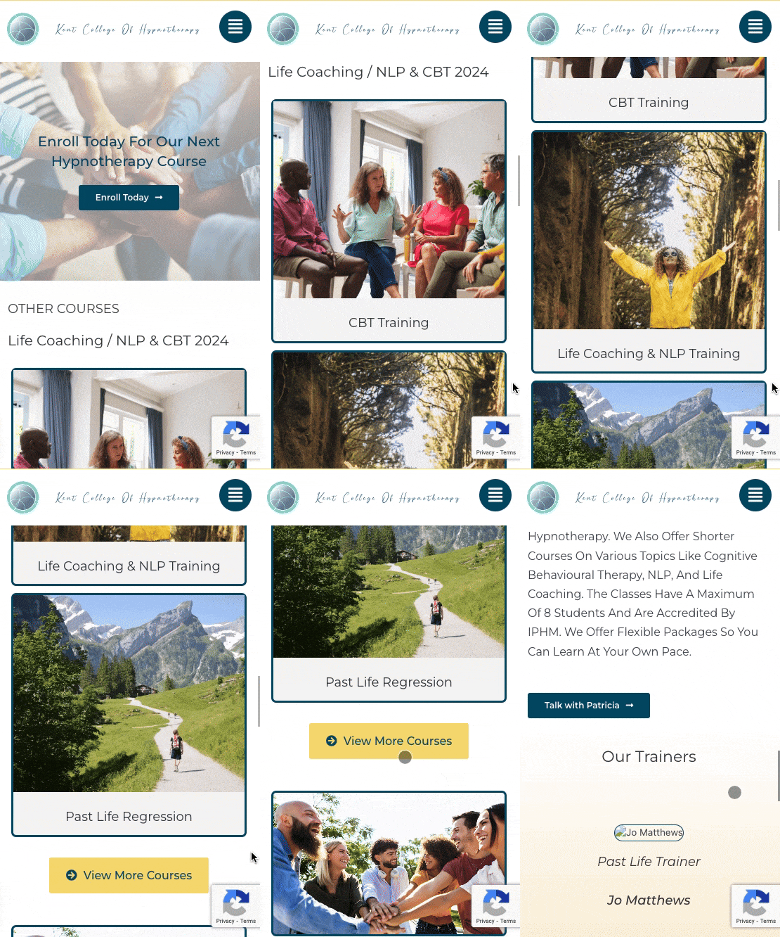
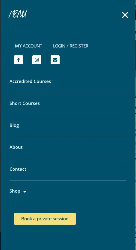
A comprehensive redesign of the Kent College of Hypnotherapy website to modernise the user experience, enhance mobile responsiveness, and incorporate a dedicated student portal for course management.
OBJECTIVES
The primary aim was to modernise the website’s look and feel, enhance mobile responsiveness, and add a comprehensive student portal. This was in response to Patricia’s need to align the website with current digital trends and make it a more effective tool for her students and staff.
MARKET ANALYSIS
A thorough analysis revealed the increasing importance of online learning platforms, especially post-pandemic. The need for accessible, mobile-friendly educational resources was evident, as more students and professionals are seeking online learning opportunities that they can access from various devices.
COMPETITOR ANALYSIS
Reviewed multiple websites of similar educational institutions. This investigation highlighted several key features that were consistently effective in engaging users, such as interactive course previews, streamlined navigation, and responsive design. Noted the integration of student portals in some leading sites, offering a one-stop solution for course management.
USER SURVEYS/INTERVIEWS
Engaged with a diverse group of existing students and faculty through online surveys and interviews. These surveys were designed to understand the users’ experience with the old website and gather insights on what features they felt were missing or needed improvement.
USER PERSONAS
Developed several user personas to represent the primary users of the website. This included personas like ‘New Student’, who is unfamiliar with the platform and looking for course information; ‘Returning Student’, who needs to access course materials and manage their enrolment; and ‘Faculty Member’, who interacts with students. These personas helped in understanding the different needs and behaviours of each user type.
USER JOURNEY MAPS
Created detailed user journey maps for each persona. These maps traced the steps taken by users from the point of first visiting the website to browsing courses, enrolling, and completing a course. This exercise helped in identifying key touchpoints where the user’s experience could be enhanced and the process streamlined.
USER ENGAGEMENT
Post-launch analytics showed a significant increase in user engagement. This was evidenced by longer session durations and lower bounce rates, indicating that users were finding the website more compelling and easier to navigate.
COURSE ENROLMENT RATES
There was a notable increase in course enrolment rates following the redesign. The more streamlined enrolment process and the improved presentation of course information contributed to this uptick.
POSITIVE FEEDBACK
Both students and faculty provided overwhelmingly positive feedback. Students appreciated the ease of accessing courses and resources, while faculty members found the updated content management system more efficient for course updates and student interaction.
