We were tasked with a mobile phone repair shop owner in Chesterfield, UK. Phone Booth aimed to transform their local business into a dynamic e-commerce platform, offering mobile phone repairs with a special emphasis on trendy branding and flexible payment options.
This case study explores how we developed a distinctive logo, an engaging website, and integrated Klarna’s payment system to revolutionise Phone Booth’s business.
Phone Booth faced the challenge of launching an e-commerce website that not only showcased their services effectively but also provided a user-friendly booking system with instalment payment options. They also wanted a brand identity that resonated with a younger audience through a funky and vibrant design.

UNDERSTANDING USER NEEDS
The initial phase of the UX design process involved a deep dive into understanding the needs, preferences, and behaviours of Phone Booth’s target audience. We conducted user research which helped me identify key functionalities and features that would be most valuable to the users, such as easy navigation to repair services, clear pricing information, and straightforward booking processes.
DEVELOPING A USER-CENTRIC INTERFACE
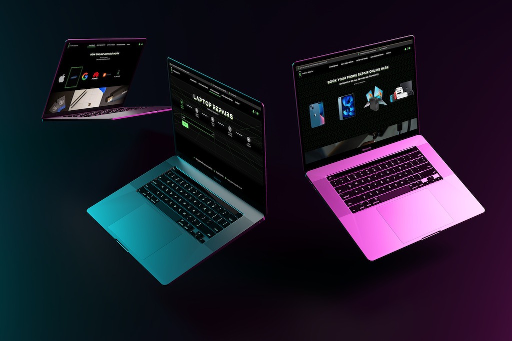
We paid particular attention to ensuring that the website was accessible and easy to navigate on various devices, acknowledging the importance of a responsive design as the target audience was targeted at ages from 16 – 32.
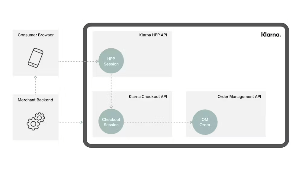
The layout was structured to guide users effortlessly from landing on the homepage to finding repair services, making an appointment, and finally, to the checkout process with Klarna’s payment integration.

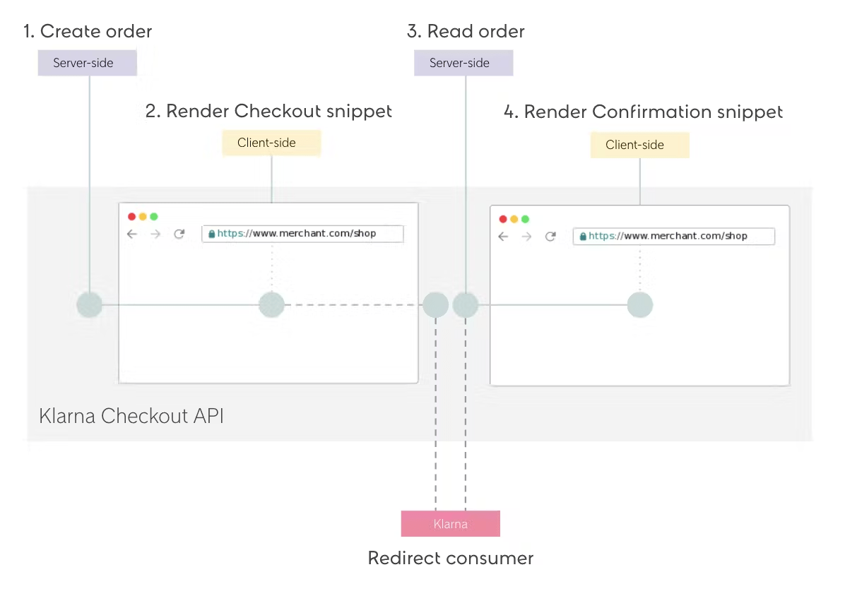
Implementing Klarna’s payment system into the WordPress site involved setting up and configuring the Klarna Payments plugin to align with the site’s e-commerce functionalities. This integration allowed customers to choose Klarna for instalment payments, enhancing the flexibility and convenience of the checkout process.
We focused on ensuring a smooth and secure transaction experience, without affecting the site’s overall performance and user experience.
STRIPE
Alongside Klarna, we integrated Stripe to offer a wider range of payment methods. Using the Stripe plugin for WordPress, we set up a streamlined payment process, aligning with the site’s branding. Stripe’s inclusion provided a secure and efficient way to handle various payment methods, including credit and debit cards, complementing the Klarna integration and catering to diverse customer preferences.
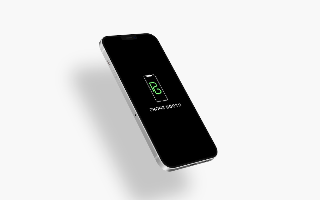
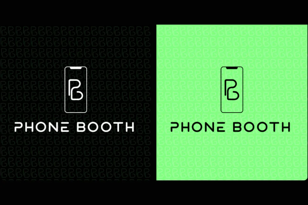
The creative journey for the “Phone Booth” logo began with the innovative idea of integrating the letters “P” and “B” to form a single, cohesive symbol. This design choice was not only a nod to the business’s name but also a clever way to create a memorable and distinctive brand mark. The fusion of the two letters symbolised the seamless and integrated service Phone Booth aimed to provide.
We brainstormed various ways to intertwine these letters, eventually crafting a design where the ‘P’ seamlessly falls into the ‘B,’ creating a unified and striking emblem. This conceptualisation phase was crucial in setting the foundation for a logo that was both meaningful and visually impactful.
The choice of a bright green colour was intentional to give the logo a vibrant, neon-like feel, resonating with the trendy and modern ethos of the business. This eye-catching shade of green was selected not only for its high visibility but also for its connotations of energy and innovation, qualities that Phone Booth’s brand embodies. In terms of typography, we opted for a style that was youthful, cool, and easily readable. The chosen font had to complement the logo’s graphic element while also appealing to the younger demographic.
The typography was crafted to balance trendiness with professionalism, ensuring that the logo would be appealing and accessible to a wide audience.
The final design phase involved refining the graphic symbol and typography, ensuring that they worked harmoniously together. The interplay between the symbolic ‘PB’ emblem and the carefully selected typography resulted in a logo that was not just a visual identifier but a representation of the brand’s core values and appeal. The final logo stood out for its simplicity, memorability, and ability to convey the brand’s message at a glance. It encapsulated the essence of Phone Booth – a dynamic, approachable, and forward-thinking mobile phone repair service.